99 Bottles of Beer on the Wall
Come and settle in, gentle folk, to hear the terrifying tale of how your favorite beer labels are born. ’Tis a most sweeping epic to be sure— full of mystery, love and devilry most foul! Ah, I almost forgot: Every story has a beginning, but first, a bit of history to set the mood. Long ago, in ancient times when fire was the latest rage and vengeful gods lived just beyond the known world, my primeval labelmaking ancestors decided that drawing pictures of naked people on pots and vases was something worth doing, and not creepy, weird and a total waste of time. These people were likely burned alive or drowned, but the ones who survived continued their dark works in secret, away from the prying eyes of actual intelligent humans, probably inside of the historical equivalent of our modern dumpsters.
Gradually, these dumpster folk would create vague stories on their vases, using unsettling pictures about, like, killing a deer, or the naked Olympics or some other such nonsense. Many years later, when science discovered that booze could be stored in pre-made containers, the hoary dumpster people’s vessels were seized and they themselves rounded up and shipped to a small, lonesome island in the Mediterranean. This island is the location of our present-day Atlantis. Thus, the “beer label” was born!
A lot has happened since those times, most importantly the invention of glass bottles, which we all know to be the pinnacle of human endeavor. These bottles, and the miraculous texts Photoshop and Illustrator for Dummies acquired in the American-Atlantis wars of a now-forgotten age, have given rise to most of the contemporary beer-label-making process. These eventually led to other innovations such as “Googling how the pen tool works in Illustrator” and “Watching a YouTube video on values and complementary colors.” These techniques, while standardized and perfected, lacked something that our ancestors had lost to the sands of time—something that would not be entertained again until the Craft Beer Era of the 1990s-ish.
At the beginning of this era, an unearthed Atlantian urn featuring a pictograph of a guy in a loincloth spearing a water buffalo sparked the idea that characters could be used as branded images. They would humanize your product into something relatable, maybe even playing on media nostalgia, which in turn would retain customer loyalty. As a shocked world looked on, beer label graphics grew into a slightly interesting thing that breweries might want to look into, if they plan to place their product into retail stores.
The rest, as we say, is history.
Now we can begin the sordid tale of the “process.” It begins as several normal humans and one subhuman troglodyte (the “designer”) sit around a conference table and brainstorm ideas for a beer name. The designer must never be allowed to participate in this part of the process for thoughtfully articulated reasons like “That’s lame” and “No, you’re a dumbass.”
After Googling their chosen new beer name and cursing every other brewery for beating them to it, they will settle on the one word in the Oxford English Dictionary that no other brewery has taken. Probably something like “benefactor.” If that name is taken, they will add an adjective in front of it. Probably something like “mysterious.”
Great job!
After this, the process grows into its larval stage, and the designer crawls into a warm mud pit on a river bank, where they stare at the warm glow of a blank screen for three weeks. During these weeks, vague ideas grow on the outward-hanging stalks of the designer’s mind. When they are fresh the designer consumes them for nourishment.
Chasing nostalgia keeps the designer’s legs from atrophying during this process, but it is only passively beneficial. Sometimes an idea stalk will produce the rare “new idea”; this is immediately discarded as trash until a “commercially viable idea” buds. Upon hearing the phrase “the beer is in the bright”—meaning it’s almost ready to bottle and label—the designer will become bloated, agitated and hostile, eventually producing the elusive “preliminary.”
At this phase, the preliminary is shuffled around, vaguely glanced at and returned to the designer with a resounding, “Whatever. You’re late. Run with it; we need labels soon.”
After this, the designer must face and defeat four demons. The first being the dread “TTB Label Approval Process” dodging the dragons of the federal Alcohol and Tobacco Tax and Trade Bureau (TTB), in which your label must navigate a maze of contradictions and avoid using words like “extra strength,” “Belgian” or “I hate the TTB.” The second demon is a smaller, multi-headed version of the first that goes by the name of “State Registration” or, in the dark tongue of the northern warlocks, “Nyurepthodes.” The third demon has no other name than “The Printers,” and it wields two splintered, burning staves known in the terror realms as “Proofs” and “Shipping Delays.” The last demon is self-doubt, which takes the form of the designer meekly sobbing into a mirror.
After the labels arrive and are birthed from their cardboard shipping womb, they are placed repetitively on bottles, which are then shipped out and never seen by their creator again. A single tear will roll down the designer’s cheek, and “Circle of Life” from Disney’s The Lion King will play in the distance.
What’s in a Label
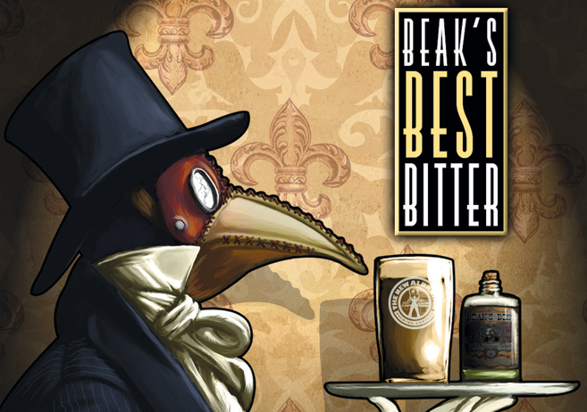
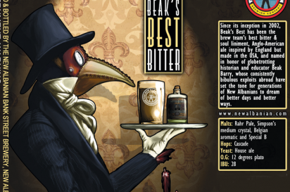
New Albanian Brewing Company’s “Beak’s Best” Type of Beer American Bitter / Extra Special Bitter
The Name: This beer was named after someone’s family member, who was called “Beak” for his prominent nose.
The Meaning: Originally, the label had a cartoonish depiction of the beer’s namesake. We were trying to do a rebrand at one point. I had recently been to a masquerade-ball-themed wedding and one of my friends wore a plague doctor mask that fit the name quite well.
The Story: ESB (Extra Special Bitter) isn’t a super popular style in the U.S., so many people approach it with some trepidation, especially with the term “bitter” prominently in the name. So here is this mysterious guy offering you something you might not have had before, but it’s on a silver platter and he’s got on a top hat. Seems trustworthy, right?
Between the Lines: If you look closely, there are bird feathers falling out of his sleeve. What sort of creature is really behind that mask?
The Takeaway: “I don’t like the word ‘bitter,’ but this chap seems so refined! I’ll give it a try!”
If you Go:
New Albanian Brewing Company Café & Brewhouse
415 Bank St., New Albany
NewAlbanian.com


